DISCIERNE RE-DESIGN (UX/UI PROJECT)
As a leader in market analysis for the education sector in Mexico, the company needed a digital presence that effectively showcased its data-driven insights and research capabilities. To enhance usability and engagement, we focused on refreshing the brand identity, developing a structured design system, and creating a more intuitive way to present information. Additionally, we designed a modular landing page system to support lead generation and improve user interaction.
Through user research, iterative design, and usability testing, we built a solution that aligned with the company’s expertise while ensuring a seamless experience for its audience.
Here’s how the process unfolded.
MAIN TASKS:
- Research
- Ideation
- Wireframing
- Design system
- Visual design
- Testing

1- Empathize: Understanding the Problem
To improve the platform, we first needed to understand user needs and business goals. Research revealed challenges in data accessibility and lead generation. Surveys and interviews helped to identify pain points, shaping a redesign that balanced usability with the company’s objectives.
Context & Challenge
- The company had an outdated website that was not optimized for usability or lead generation.
- The need for a clearer presentation of data from their proprietary algorithm and market research.
- The absence of a structured landing page system to attract leads.
User Research & Insights
- Methods Used: Surveys, interviews, competitive analysis, usability testing.
- Key Findings: Users struggled to find relevant insights quickly.
- The previous design lacked visual hierarchy and clear navigation.
- Potential clients (universities, analysts) wanted personalized data insights.
- To find a strategy to generate leads that might contribute with more sales.

2- Define: Problem Statement
«How might we create an intuitive, visually engaging
platform that improves access to market research insights
and effectively generates leads?»
3- Ideate: Exploring Solutions
Understanding digital channels of the company
- The company has a main website, social media presence and several landing pages, as the diagram below shows.
- The green lines on the diagram, are those paths for achieving conversions.
- The green nodes are the hubs in order to achieve conversions.
- The doted orange lines achieve communication with users but do not create immediate leads.

Start working based on the research and insights
- With the gathered information, I start the revamping of the main website with a new structure.
- I created a landing page template for multiple purposes due to the importance for generating leads
- Creation of a design system that allows the use components facilitating the development of the website.
Branding & Design System
- Refreshing the brand identity to align with modern, data-driven aesthetics.
- Typography, colors, UI components for consistency across web and landing pages.
Information Architecture & Wireframes
- Reorganizing content based on user needs.
- New navigation structure that prioritizes key insights and lead capture.
- Wireframe examples showing initial concepts.
- The main goal is to develop a platform that communicates the true values of Discierne as a brand.
- To identify which channels of communication with the users create more conversions.

4- Prototype: Bringing Ideas to Life
With a solid foundation, the next step was translating research insights into high-fidelity designs, refining interactions, and optimizing usability.
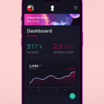
High-Fidelity UI Design
I developed a clean, modern interface aligned with the new brand identity, ensuring complex market data was easy to navigate and understand.
Landing Page System for Lead Generation
A modular landing page system was designed to target different audiences, improving lead generation through structured content and clear calls to action.


«The redesign significantly improved usability and strengthened our digital presence, making our data more accessible and engaging.»
DISCIERNE CEO
5- Test: Refining the Experience
To validate the design, I conducted a quick usability test using the think-aloud method, where users navigated the prototype while sharing their thoughts. Feedback highlighted minor usability issues, leading to a small iteration that refined key elements for a smoother experience before final implementation.


6- Conclusion, Results and Learnings
Impact and Results
The redesign successfully improved the platform’s usability, making data more accessible and enhancing the company’s digital presence. The structured landing page system provided a more effective way to generate leads, aligning with business objectives.
Key Learnings
This project reinforced the importance of user research in guiding design decisions. Quick usability testing, even with simple methods, proved valuable in refining the experience. Additionally, creating a flexible design system ensured consistency while allowing for future scalability.
Next Steps
With the foundation in place, future iterations could further refine the landing page system through A/B testing and data analysis. Expanding usability tests with more users would provide deeper insights to optimize the experience even further.